Quality tools have been our focus over the past few months as a means of refreshing their importance within the quality improvement framework. We’ve discussed Root Cause Analysis (RCA), Thought Map, and began our highlights of the 7 Quality Tools through a discussion of Check Sheets. If you recall, these seven basic management tools were originated by Kaoru Ishikawa, who believed that 90 percent of the problems in a business can be solved by using one or more of these seven basic tools. This time, we look at another tool of the seven, the Pareto chart.
 In summary, you can see the absolute value of each category graphically, as well as it’s relative value to other categories examined. Equally relevant, note that it is observed that ‘Not on File’ and ‘Addition’ create 63% of the problems measured and are primary targets for process improvement efforts.
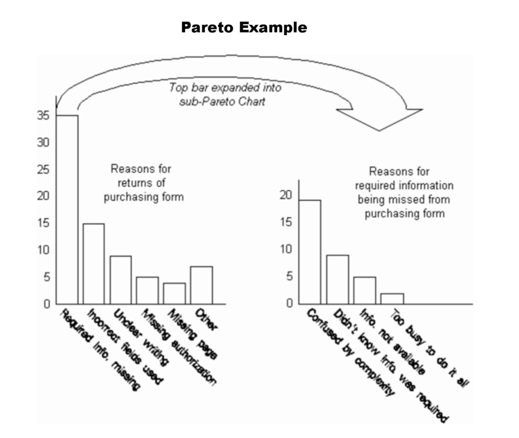
Here’s a simple example of using a Pareto Chart to solve a cost problem
1.) Problem – A purchasing department wastes time going back to managers who have incorrectly filled out required forms.
2.) Categories – REASONS FOR RETURNS – Problems that were happening with the returned forms.
3.) Measurement – The problems were recorded over 1 month and the frequencies were plotted in the first Pareto Chart.
4.) Pareto Analysis – The chart clearly shows that the biggest problem with all returned forms was ‘Required Info. missing’.
5.) Sub-Pareto chart: A second analysis was done on this issue to narrow down the causes for why the forms had missing information. This was determined from a survey of managers.
6.) Result – produced 2 forms – one clear and simple form, suited for most purposes and another more complex form only needed under a few circumstances.
In summary, you can see the absolute value of each category graphically, as well as it’s relative value to other categories examined. Equally relevant, note that it is observed that ‘Not on File’ and ‘Addition’ create 63% of the problems measured and are primary targets for process improvement efforts.
Here’s a simple example of using a Pareto Chart to solve a cost problem
1.) Problem – A purchasing department wastes time going back to managers who have incorrectly filled out required forms.
2.) Categories – REASONS FOR RETURNS – Problems that were happening with the returned forms.
3.) Measurement – The problems were recorded over 1 month and the frequencies were plotted in the first Pareto Chart.
4.) Pareto Analysis – The chart clearly shows that the biggest problem with all returned forms was ‘Required Info. missing’.
5.) Sub-Pareto chart: A second analysis was done on this issue to narrow down the causes for why the forms had missing information. This was determined from a survey of managers.
6.) Result – produced 2 forms – one clear and simple form, suited for most purposes and another more complex form only needed under a few circumstances.
 Other Examples:
– As discussed in a previous blog, a Defect Type Check Sheet is developed on the production line to determine the frequency of identified types of defects occurring during a production run. A Pareto Analysis can be used to further analyze and prioritize the process improvement efforts.
– A publisher draws a Pareto Chart of errors found in published books. An ordered checklist is produced for proofreaders.
So, what are some of the questions a Pareto Analysis can answer:
– What are the most important issues facing our team or business?
– What 20% of sources are causing 80% of the problems?
– Where should we focus our efforts to maximize our biggest quality improvements?
Other Examples:
– As discussed in a previous blog, a Defect Type Check Sheet is developed on the production line to determine the frequency of identified types of defects occurring during a production run. A Pareto Analysis can be used to further analyze and prioritize the process improvement efforts.
– A publisher draws a Pareto Chart of errors found in published books. An ordered checklist is produced for proofreaders.
So, what are some of the questions a Pareto Analysis can answer:
– What are the most important issues facing our team or business?
– What 20% of sources are causing 80% of the problems?
– Where should we focus our efforts to maximize our biggest quality improvements?
What is a Pareto Chart?
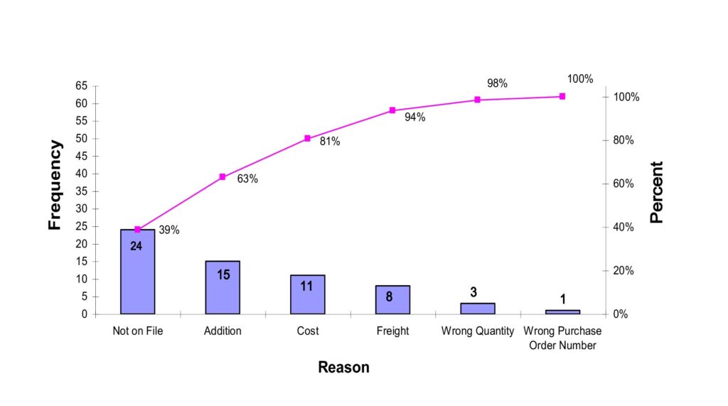
The Pareto chart, developed by Vilfredo Pareto, an 18th-century Italian economist, observed that 80% of the wealth of a country was owned by about 20% of the population and that this pattern repeated itself within the wealthy group. J.M. Juran called this generalization the ‘Pareto Principle, or commonly known as the 80/20 rule. A Pareto Analysis takes into consideration this principle. Given a set of recurring problems, it is common that a few problems will occur to a greater degree than all the other problems combined. A Pareto Analysis can be used to analyze this unequal distribution of occurrences and separate out the ‘vital few’ from the ‘trivial many’. The basic Pareto chart is designed to compare the frequencies of an occurrence, according to problem categories. In the figure below you can see that the measured data (bars) are arranged according to categories and plotted against the corresponding frequency. The categories, or bars, are listed in decreasing order. The totals can be noted within bars and are very easy to read and interpret. The chart also uses a line graphic to establish cumulative percentages across the graph. As the category frequency decreases from largest to smallest, cumulative percentage increases to 100 percent.
In summary, you can see the absolute value of each category graphically, as well as it’s relative value to other categories examined. Equally relevant, note that it is observed that ‘Not on File’ and ‘Addition’ create 63% of the problems measured and are primary targets for process improvement efforts.
Here’s a simple example of using a Pareto Chart to solve a cost problem
1.) Problem – A purchasing department wastes time going back to managers who have incorrectly filled out required forms.
2.) Categories – REASONS FOR RETURNS – Problems that were happening with the returned forms.
3.) Measurement – The problems were recorded over 1 month and the frequencies were plotted in the first Pareto Chart.
4.) Pareto Analysis – The chart clearly shows that the biggest problem with all returned forms was ‘Required Info. missing’.
5.) Sub-Pareto chart: A second analysis was done on this issue to narrow down the causes for why the forms had missing information. This was determined from a survey of managers.
6.) Result – produced 2 forms – one clear and simple form, suited for most purposes and another more complex form only needed under a few circumstances.
Other Examples:
– As discussed in a previous blog, a Defect Type Check Sheet is developed on the production line to determine the frequency of identified types of defects occurring during a production run. A Pareto Analysis can be used to further analyze and prioritize the process improvement efforts.
– A publisher draws a Pareto Chart of errors found in published books. An ordered checklist is produced for proofreaders.
So, what are some of the questions a Pareto Analysis can answer:
– What are the most important issues facing our team or business?
– What 20% of sources are causing 80% of the problems?
– Where should we focus our efforts to maximize our biggest quality improvements?